

We constantly hear that content needs to be highly visual to get any traction. That’s completely true. The issue is that most marketing teams don’t have an in-house design studio ready to turn out custom graphics on short notice. You’re often stuck piecing things together in a browser, trying to make an image look like it wasn’t pulled from a stock site a decade ago.
Digital marketing moves at a brutal pace. If you manage paid search or social campaigns, the amount of creative needed just to avoid ad fatigue is overwhelming. You can’t wait two weeks for a design agency to return a layout. You need assets right now.
Stop Overcomplicating Your Tech Stack
There’s a serious software bloat problem in digital marketing today. Every time a new visual format trends, people grab another subscription. Before long, you’re juggling six different platforms just to make one campaign run across web, email, and social media.
The truth is that complex design suites are made for professional illustrators and layout artists. When a content manager or strategist tries to use them, they spend more time wrestling with the interface than actually creating content. Click the wrong layer, mess up the alignment, and half an hour disappears.
Most small teams struggle with visual marketing because they try to copy large agencies. They buy the same software the big players use, thinking it’ll automatically boost their results. Instead, they get stuck in features they never really need. Your goal isn’t to master a tool. It’s to get a strong image in front of a potential customer as fast as possible.
The key to moving quickly is trimming down to tools that handle specific conversions or styling jobs. You don’t need a huge enterprise suite to make good visuals. You just need a practical workflow that takes an idea to a publishable asset fast. A clean, simple image with a bold headline will always beat an overworked graphic that misses the main message.
Finding the Right Starting Point for Visuals
Starting from a blank canvas is a huge time sink. The fastest way to build a visual story is to start with a foundation that already matches the mood or context you need. Often you know exactly what kind of background or environment you want but spend hours scrolling through generic photo libraries.
Stock photos have a distinct, polished look that consumers instantly recognize and ignore. This banner blindness kills engagement. You need imagery that feels native to the platform where it will be viewed.
A better approach is to use an online scene search tool. This AI tool helps you find specific video scenes in seconds, saving you hours of manual searching. Instead of relying on generic keywords, you can filter by visual details like lighting or composition to find the perfect background or reference image for your project.
Once you have a solid environmental baseline, you can drop in your own product shots or text overlays. It cuts the asset sourcing time from an hour down to a few minutes. More importantly, it gives you a realistic setting that grounds your visual story.
Giving Your Graphics a Distinct Style
Once you have your base visuals, the challenge is making them look cohesive. If you are targeting a younger demographic or running a niche campaign on platforms like Reddit or Discord, standard corporate vectors completely fail to connect.
Different channels require different visual languages. What works on a corporate landing page will completely flop on a gaming community forum. But hiring freelance illustrators for every distinct audience segment destroys your campaign budget.
A very effective workaround is applying stylized generation to your existing assets. Using an AI Anime Creator allows you to feed basic structural images or text prompts into the system and get back highly stylized, targeted artwork. This is a practical way to bypass expensive custom illustration when you need a specific aesthetic for an ad set.
You keep your brand colors and layout, but the artwork suddenly fits the exact subculture you are trying to reach. It allows a small team to test wildly different visual styles in their market testing without burning through thousands of dollars in design fees. If the new style drops your cost per click by twenty percent, you scale it. If it fails, you move on to the next style test without regret.
Making Static Content Move
Social platforms heavily penalize static images in their algorithms. We all know video gets better reach and cheaper clicks on ad networks. But producing actual video from scratch is a logistical nightmare when you are strapped for time.
You have to worry about lighting, audio, editing timelines, and export settings. It is too much operational overhead for a daily content calendar.
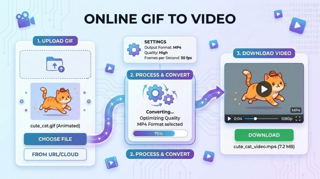
The workaround here is animation conversion. You probably already have simple animations, rotating product shots, or looping graphics lying around in older formats. The problem is that many ad managers and modern social feeds reject lightweight image animations or compress them until they look terrible.
Running these files through an Online GIF to video converter gives you a standard video file that ad networks prefer. The platforms treat it as high value video content, and you do not have to open a timeline editor or render a massive project file. You simply upload your looping asset, convert it into a video container, and push it live. It’s a fast task that immediately satisfies the algorithm preferences for motion.
Structuring Your Assets for Scale
Organization is usually where people without design backgrounds fail. You end up with a desktop full of files named final version three real. It becomes almost impossible to find the right asset when a client or stakeholder asks for a quick text change three weeks later.
Keep your files organized in one cloud drive. Stick with a clear naming convention that includes the date, campaign name, and dimensions. It might sound dull, but this kind of operational discipline can save you hours of stress when deadlines are close.
When you manage several clients or internal stakeholders, approval bottlenecks can easily ruin your publishing schedule. Sending raw image files by email only creates messy feedback threads. Instead, drop your drafted visuals into a shared document or staging link where stakeholders can leave direct comments. Keep the review process in one place. If someone wants the shade of blue changed, they log it in the document. This keeps you from constantly chasing feedback across message boards and email chains.
Build templates for your most common formats. If you know you need a featured image for a blog post every Tuesday, set up a layout that works. Swap the background, change the text, and publish. Stop reinventing the wheel for every single deliverable.
The Workflow That Actually Ships
Set a strict time limit on asset creation. If a graphic takes more than thirty minutes to produce, you are probably overthinking it. The main goal is driving engagement and communicating clearly. Fine art awards do not matter here, really.
Test your visuals right away. Drop them into your ad sets or schedule a few social posts to see how the audience reacts. If a certain style or motion graphic performs well, record that same workflow for next month.
You have to stay grounded in the metrics. A graphic is only good if it drives the user to take action. Focus your energy on clear messaging, readable typography, and clean layouts. Let your specialized tools handle the heavy lifting of styling and formatting.